
祝!エターナルアルカディア発売20周年
エターナルアルカディア20周年記念WEBアンソロジー企画
Manuscript Preparation Notes

原稿作成の諸注意
Manuscript Preparation Notes
同人誌に寄稿したことがない、または詳しく知らない…という方向けに、原稿のサイズや注意した方がいい事などを解説したページです。
This page explains the manuscript size of Japanese doujinshi and precautions when preparing manuscripts.
- 原稿サイズについて
- いろいろ解説
- About the size of manuscripts
- Detailed Explanations
原稿サイズについて
About the size of manuscripts
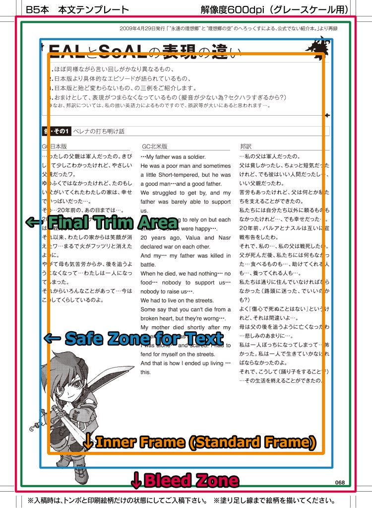
■ モノクロ・グレースケール漫画原稿の場合 ■
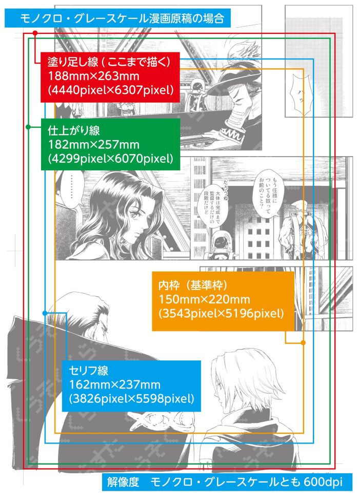
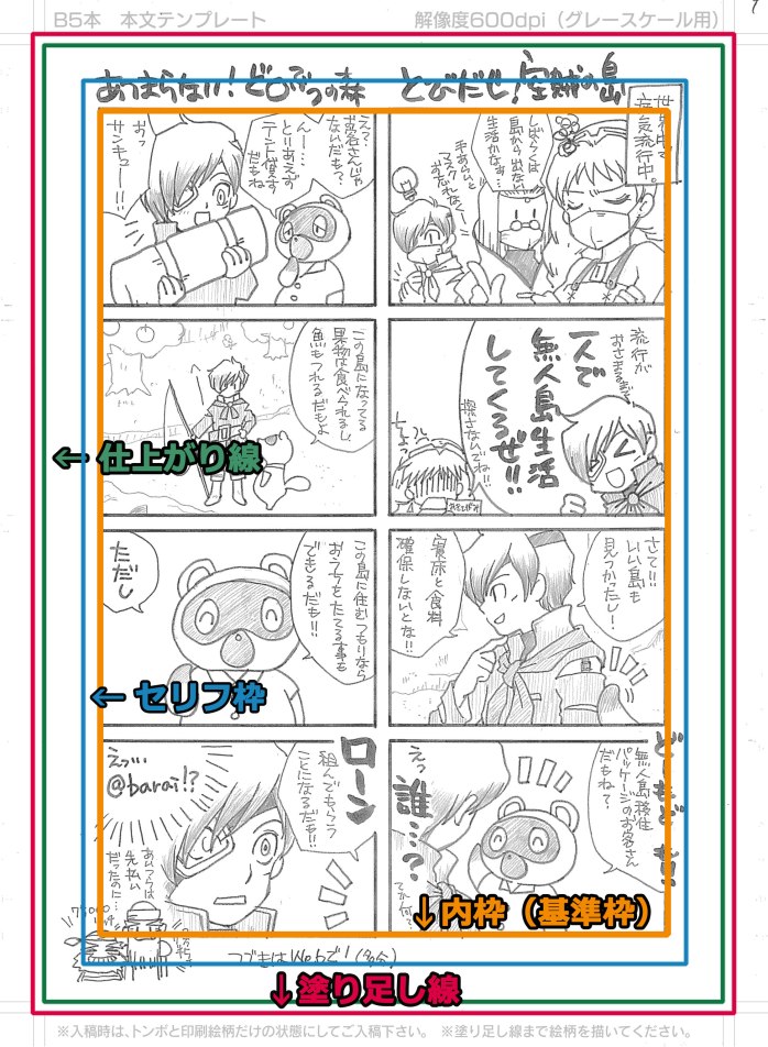
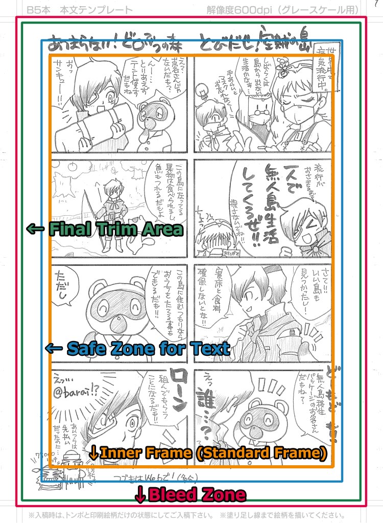
塗り足し線 188mm×263mm(4440pixel×6307pixel)
…製本・断裁時にズレが発生した場合、余白が出ないように絵柄をはみ出すように描きます。
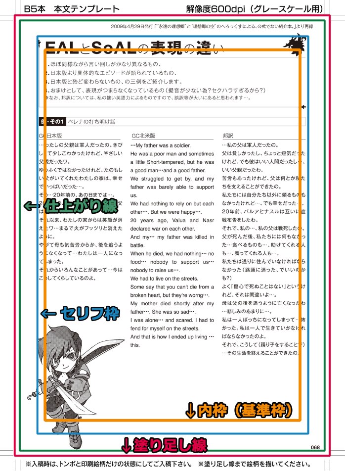
仕上がり線 182㎜×257mm(4299pixel×6070pixel)
…断裁位置を示す線です。製本された際にここまで入ります。
セリフ線 162㎜×237mm(3826pixel×5598pixel)
…漫画や小説作品の場合、セリフなどの文字はこの枠内までに収めることを推奨します。
内枠(基準枠) 150×220mm(3543pixel×5196pixel)
…漫画のコマを割る際に基準となる枠です。重要な絵やセリフはこの中に入れます。
小説などの文章作品も、この枠内に収めた方が読みやすいです。
解像度 モノクロ・グレースケールとも600dpi
※記載のサイズは全てB5原稿のものです。
■ For monochrome and grayscale cartoon/comic manuscripts ■
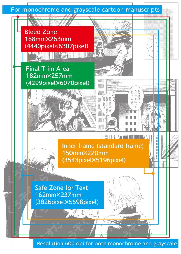
Bleed zone 188mm×263mm(4440pixel×6307pixel)
…Draw the pattern so that it overhangs to avoid margins in the event of misalignment during binding and cutting.
Final trim area 182㎜×257mm(4299pixel×6070pixel)
…This line indicates the cutting position.
Safe zone for text 162㎜×237mm(3826pixel×5598pixel)
…For manga and novel works, it is recommended that dialogue and other text be kept within this frame.
Inner frame (standard frame) 150㎜×220mm(3543pixel×5196pixel)
…This is the frame of reference for dividing the panels of a comic drawing. Important pictures and lines are placed within this frame. Novels and other written works should also be placed within this frame for easier reading.
Resolution 600 dpi for both monochrome and grayscale
*All sizes listed are for B5 (Japanese Industrial Standard) manuscripts.
■ モノクロイラスト原稿の場合 ■
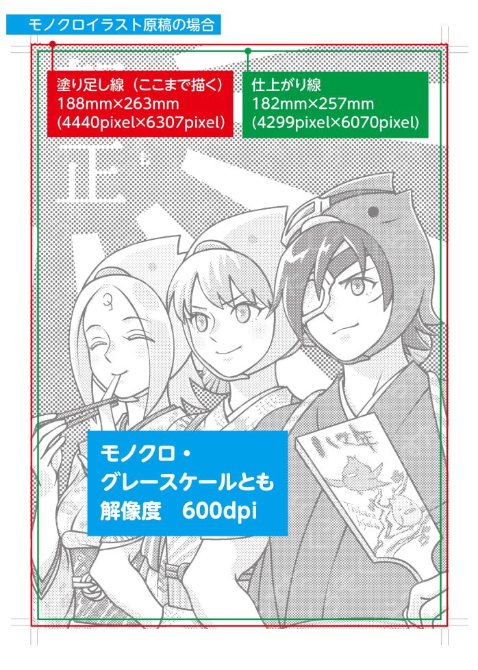
塗り足し線 188mm×263mm(4440pixel×6307pixel)
…製本・断裁時にズレが発生した場合、余白が出ないように絵柄をはみ出すように描きます。
仕上がり線 182㎜×257mm(4299pixel×6070pixel)
…断裁位置を示す線です。製本された際にここまで入ります。
解像度 モノクロ・グレースケールとも600dpi
※記載のサイズは全てB5原稿のものです。
■ For monochrome and grayscale illustration manuscripts ■
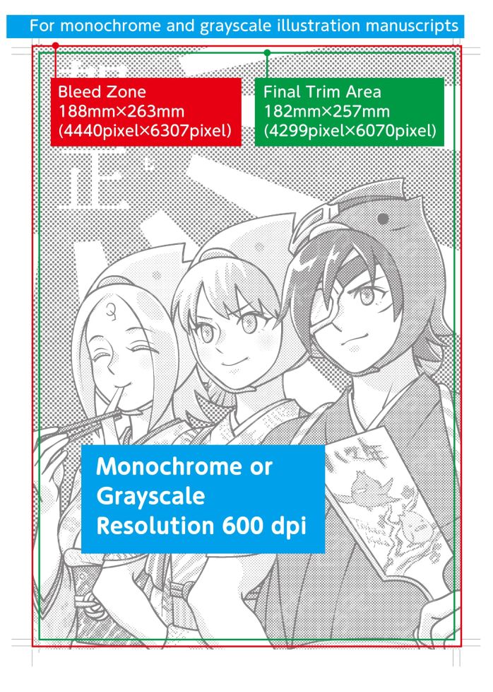
Bleed zone 188mm×263mm(4440pixel×6307pixel)
…Draw the pattern so that it overhangs to avoid margins in the event of misalignment during binding and cutting.
Final trim area 182㎜×257mm(4299pixel×6070pixel)
…This line indicates the cutting position.
Resolution 600 dpi for both monochrome and grayscale
*All sizes listed are for B5 (Japanese Industrial Standard) manuscripts.
■ カラーイラスト原稿の場合 ■
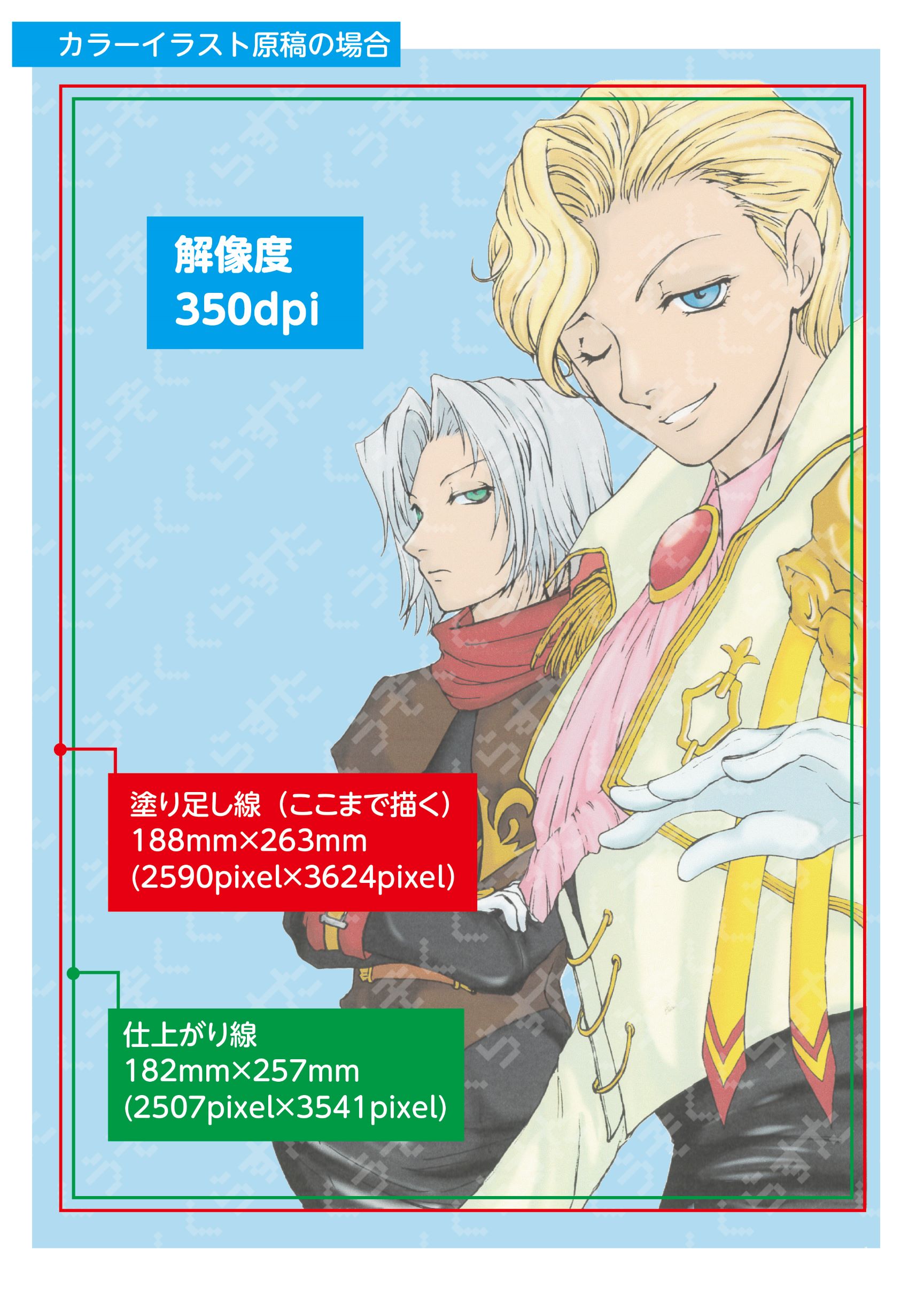
塗り足し線 188mm×263mm(2590pixel×3624pixel)
…製本・断裁時にズレが発生した場合、余白が出ないように絵柄をはみ出すように描きます。
仕上がり線 182㎜×257mm(2507pixel×3541pixel)
…断裁位置を示す線です。製本された際にここまで入ります。
解像度 350dpi
※記載のサイズは全てB5原稿のものです。
■ For color illustration manuscripts ■
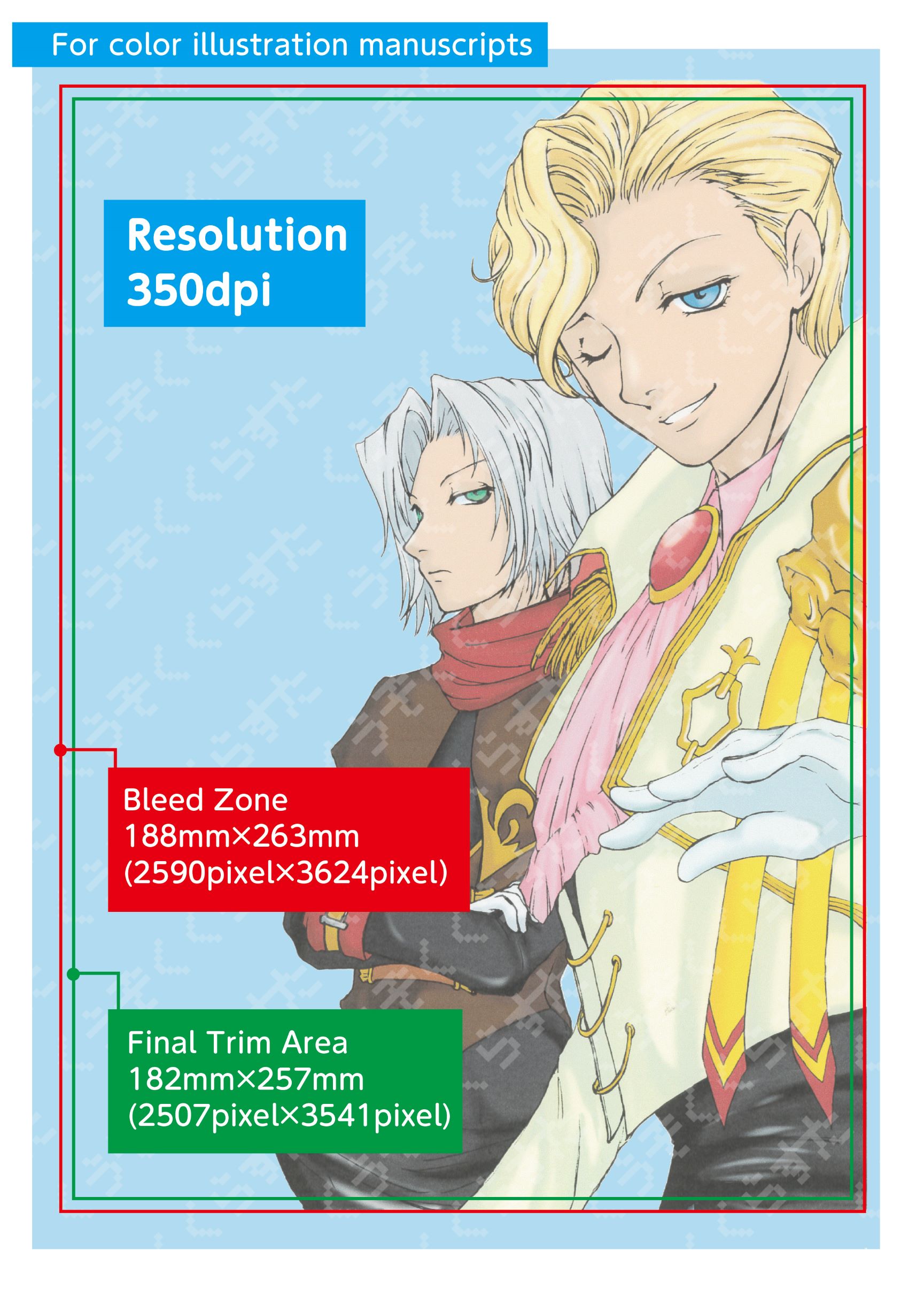
Bleed zone 188mm×263mm(2590pixel×3624pixel)
…Draw the pattern so that it overhangs to avoid margins in the event of misalignment during binding and cutting.
Final trim area 182㎜×257mm(2507pixel×3541pixel)
…This line indicates the cutting position.
Resolution 350dpi
*All sizes listed are for B5 (Japanese Industrial Standard) manuscripts.
いろいろな解説
Detailed Explanations
■ 解像度とは About Resolution ■
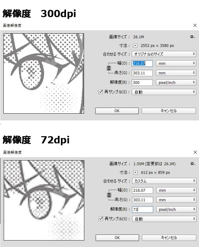
ビットマップ画像における画素の密度を示す数値のことで、画像を表現する格子の細かさを解像度と呼び、一般的には1インチをいくつに分けるかを数字によってで表すものです。
数字が大きいほど、高画質(高精密)な画像となります。
右に表示した画像は、300dpi(上段)と、72dpi(下段)の画像を比較したものです。解像度の違いで、画像の再現度が変わります。
日本の同人誌印刷所では、モノクロ・グレースケール原稿の場合は600~1200dpi、カラー原稿では350dpiでの原稿作成を推奨しています。
推奨以下の解像度で原稿を作成した場合、画像が荒くなり、作者が意図したような画像の再現がされなくなります。
低解像度で作成した画像を高解像度に変換(例えば72dpiの画像を300dpiに変換)しようとしても、画像が荒れたものになってしまいます。
逆に、高解像度の作品を、原稿サイズに合わせるために多少解像度を下げても問題ありません。
原稿作成時は、推奨以上の解像度での作業をして下さい。
Resolution is a numerical value that indicates the density of pixels in a bitmap image. The fineness of the grid that represents the image is called the resolution, and is generally expressed by a number that indicates how many parts an inch is divided into.
The higher the number, the higher quality (higher precision) the image.
The image displayed on the right compares a 300 dpi (top row) and a 72 dpi (bottom row) image. The difference in resolution changes the reproducibility of the image.
Japanese doujinshi printers recommend 600-1200 dpi for black-and-white and grayscale manuscripts, and 350 dpi for color manuscripts.
If a manuscript is created at a resolution lower than recommended, the image will be rough and will not reproduce the image as intended by the author.
Attempting to convert an image created at a lower resolution to a higher resolution (for example, converting a 72 dpi image to 300 dpi) will result in a rougher image.
Conversely, it is acceptable to reduce the resolution of a high-resolution work somewhat to fit the size of the manuscript.
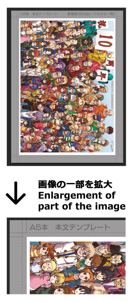
■ 塗り足し・仕上がり線とは About “Bleed Zone” “Final Trim Area” size ■
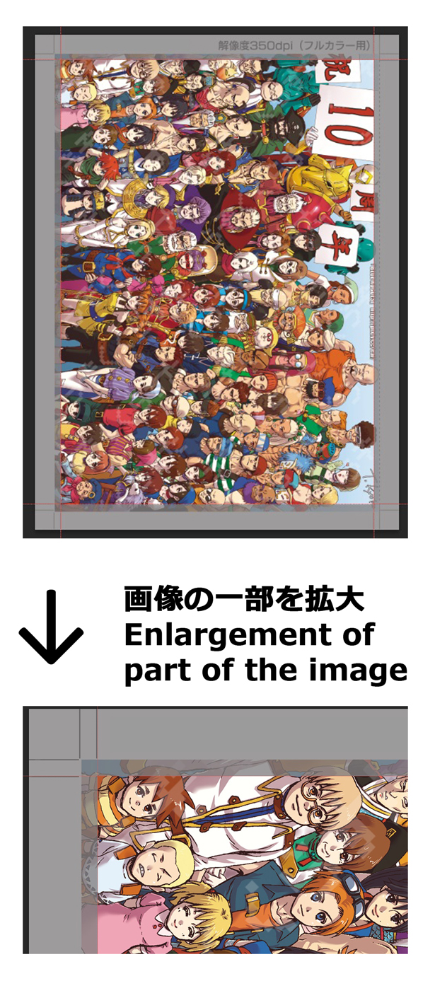
「塗り足し」とは
裁ち切り、裁ち落としとも呼ばれる部分で、製本時に断裁ズレが発生して余白(印刷が入っていない部分)が発生するのを防ぐために、仕上がり寸法より大きく絵を入れる部分です。
左のサンプル画像の、グレーになっている部分が塗り足し部分です。
サンプルのように、画面端までキャラクターなどを配置している場合、拡大図のようにキャラクターの一部が見切れてしまいます。
イラストなどで画面端ギリギリまで重要な部分を入れるのは、避けた方が無難です。
What is “Bleed Zone” ?
It is the part where a picture is inserted larger than the finished size to prevent margins (unprinted area) from occurring due to misalignment of cutting at the time of bookbinding.
In the sample image on the left, the gray area is the part that will be cut off.
If a character is placed up to the Bleed Zone as shown in the sample, a part of the character will be cut off as shown in the enlarged image.
It is best to avoid placing important parts of an illustration right up to the edge of the screen.
「仕上がり線」とは
印刷物が実際に仕上がった際の寸法です。この枠内に入っている部分は基本的に本に載ると考えて問題ないですが、断裁ズレが発生した場合微妙に差異が出ます。また、左右のどちらかは本の綴じ部分になるため、多少見え辛くなります。
上のサンプルのように、画面ギリギリ一杯までキャラクター等を配置していて、見切れてしまうのは困る…という場合は、右のサンプルのように仕上がり線より内側全体にフレームを付けて、画像を少し縮小して配置するのも一つの方法です。
What is “Final Trim Area” ?
This is the size of the printed piece when it is actually finished. The area within this frame is basically the area that will appear in the book, but if there is a discrepancy in cutting, there will be a slight difference. In addition, one of the left and right sides will be the binding part of the book, so it will be somewhat difficult to see.
If you have placed characters and other objects just inside the screen, as in the sample above, and you want to prevent them from being cut off, one way is to place a frame around the entire area inside the final trim area, slightly scaling down the size of the image.
■ 内枠とは About “Inner Frame (Standard Area)” ■
内枠とは、漫画原稿の基準となる枠で、必ず読める必要がある絵やセリフなどはこの枠内に配置するようにします。
サンプルのように、4コマ漫画の場合などは基本的にこの枠内にコマを配置します。
小説作品の場合でも、この枠内に文字を配置すれば問題ありません。
ただし、絶対にこの枠内に絵やセリフを配置しなければならない、という事ではありません。
The inner frame is the standard frame for Japanese manga manuscripts, and important pictures and lines should be placed within this frame.
In the case of a four-frame manga, such as the sample, the frame lines are basically placed within this frame.
In the case of a novel, there is no problem if the text is placed within this frame.
* It is acceptable to place pictures and lines beyond this frame.
■ セリフ枠とは About “Safe Zone for Text” ■
セリフ枠は、上記の内枠と近いもので、このライン内の文字は、製本された後で基本的に問題なく読める、という部分です。
このラインを越えると、本の綴じ部分で読みにくい箇所が出てきます。
小説原稿の場合も、内枠かセリフ枠内へ文字を配置するようにして下さい。
The “Safe Zone for Text” is similar to the “Inner Frame” mentioned above, and is the part of the book where the text within this line is basically readable without problems after the book is bound.
Beyond this line, some parts of the book will be difficult to read depending on the binding section of the book.
In the case of a novel manuscript, please place the text within the “inner frame” or “safe zone for text”.
実際に本に掲載された場合にどう見えるかのサンプルです。
セリフ枠内に配置されていても、綴じ部分(ノドといいます)の案外ギリギリになってしまう場合があります。
漫画やイラストでも同様になりますので、注意してください。
This is a sample of how it will look when it is actually published in a book.
Even if the text is placed within the “serif frame,” it may be quite close to the binding area (called the “gutter”).
The same applies to manga and illustrations, so please be careful.
■ 白黒原稿作成時の注意 Cautions when preparing B&W manuscripts ■
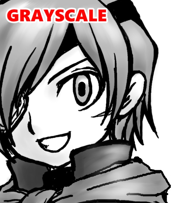
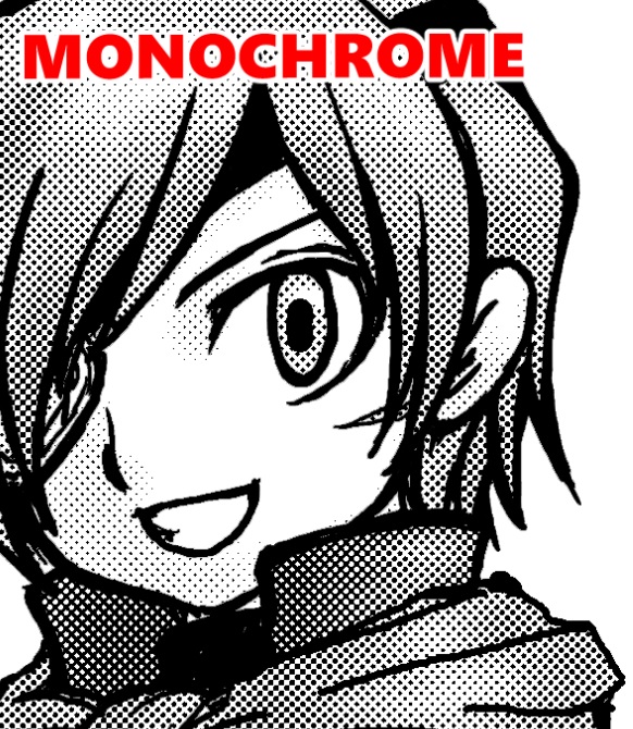
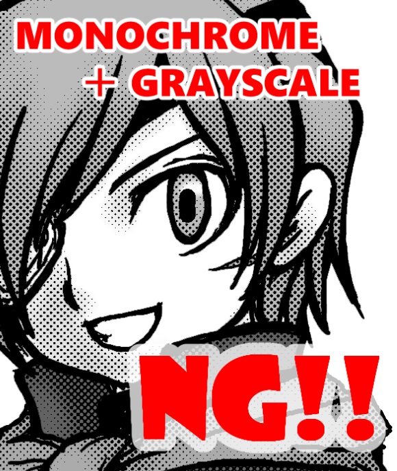
グレースケール原稿、モノクロ原稿、モノクロ+グレースケール原稿の比較サンプルです。
カラーページ以外の印刷用原稿では、モノクロ+グレスケは厳禁です!
Comparative samples of grayscale, monochrome, and monochrome + grayscale manuscripts.
For any manuscript intended for printing other than color pages, monochrome + grayscale is strictly forbidden!
WEB用、家庭用インクジェットプリンター等で印刷する場合には問題ありませんが、オフセット印刷用の原稿の場合は、印刷の際にグレー部分は細かいドットに変換されます(モノクロのオフセット印刷では、グレーのベタ塗りは出来ません)。
そのため、スクリーントーンのようなドット部分と、グレー部分が変換されて出来たドットとが干渉してしまい、モアレが発生します。
※カラーイラストの一部分などに入れる場合などは問題ありません。カラー印刷はグレー部分をドットに変換せず、そのままグレーとして表現するためです。
There is no problem when printing on web or home inkjet printers, etc. However, in the case of manuscripts for offset printing, gray areas are converted into fine dots during printing.(Solid gray cannot be used in black and white offset printing.)
Therefore, dots like screen tones interfere with dots created by converting gray areas, resulting in moiré.
This is not a problem when the gray area is used as a part of a color illustration. This is because color printing does not convert gray areas into dots, but expresses them as gray as they are.
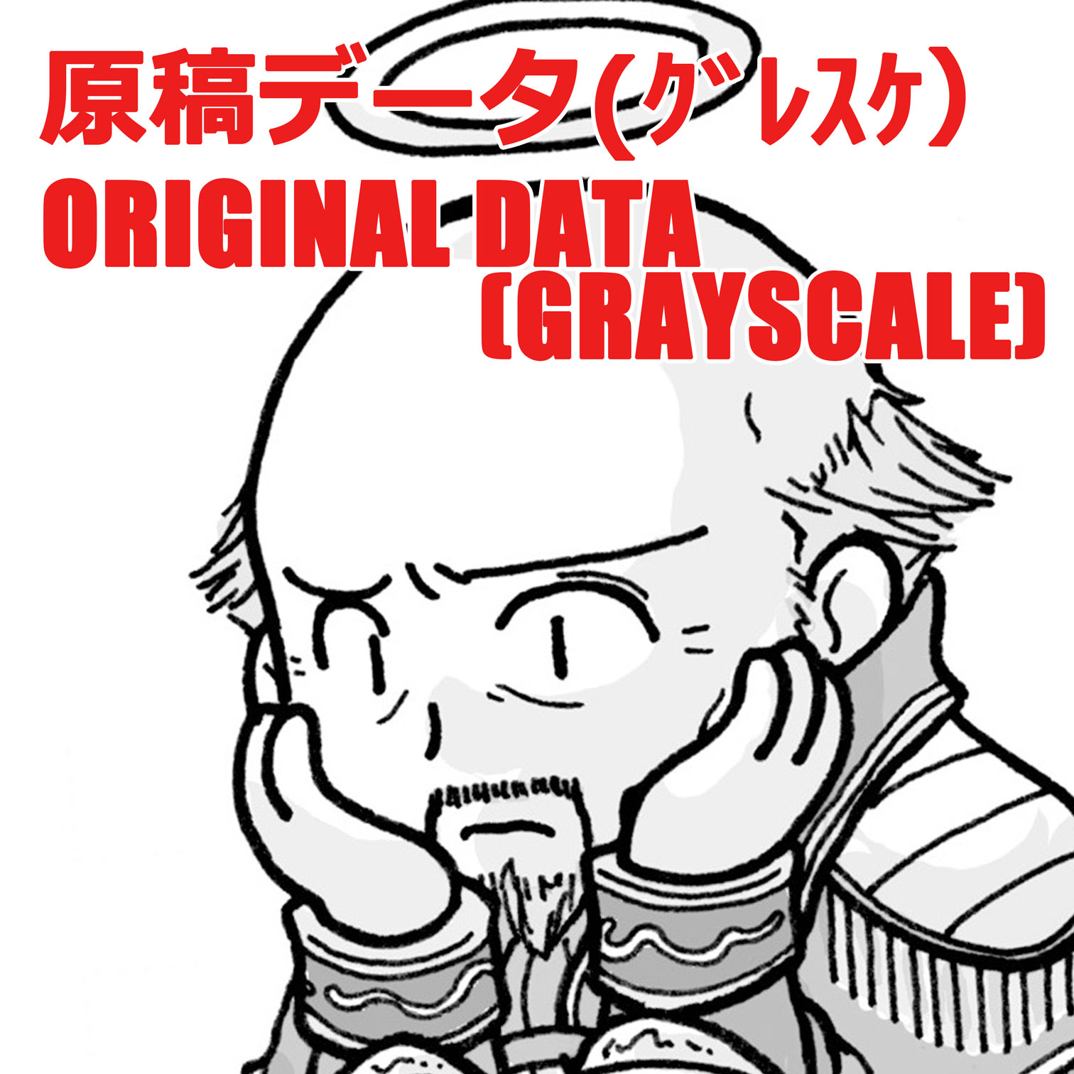
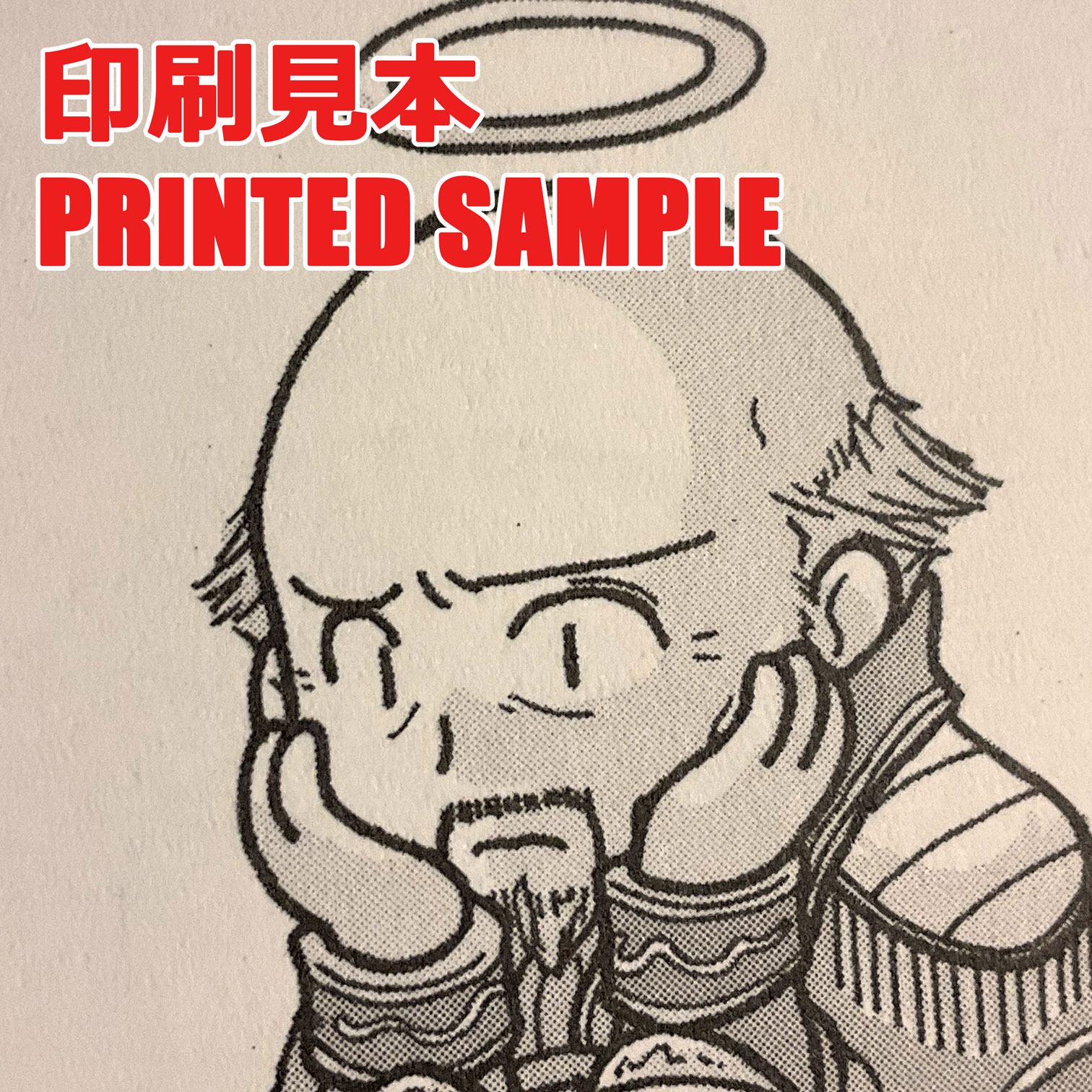
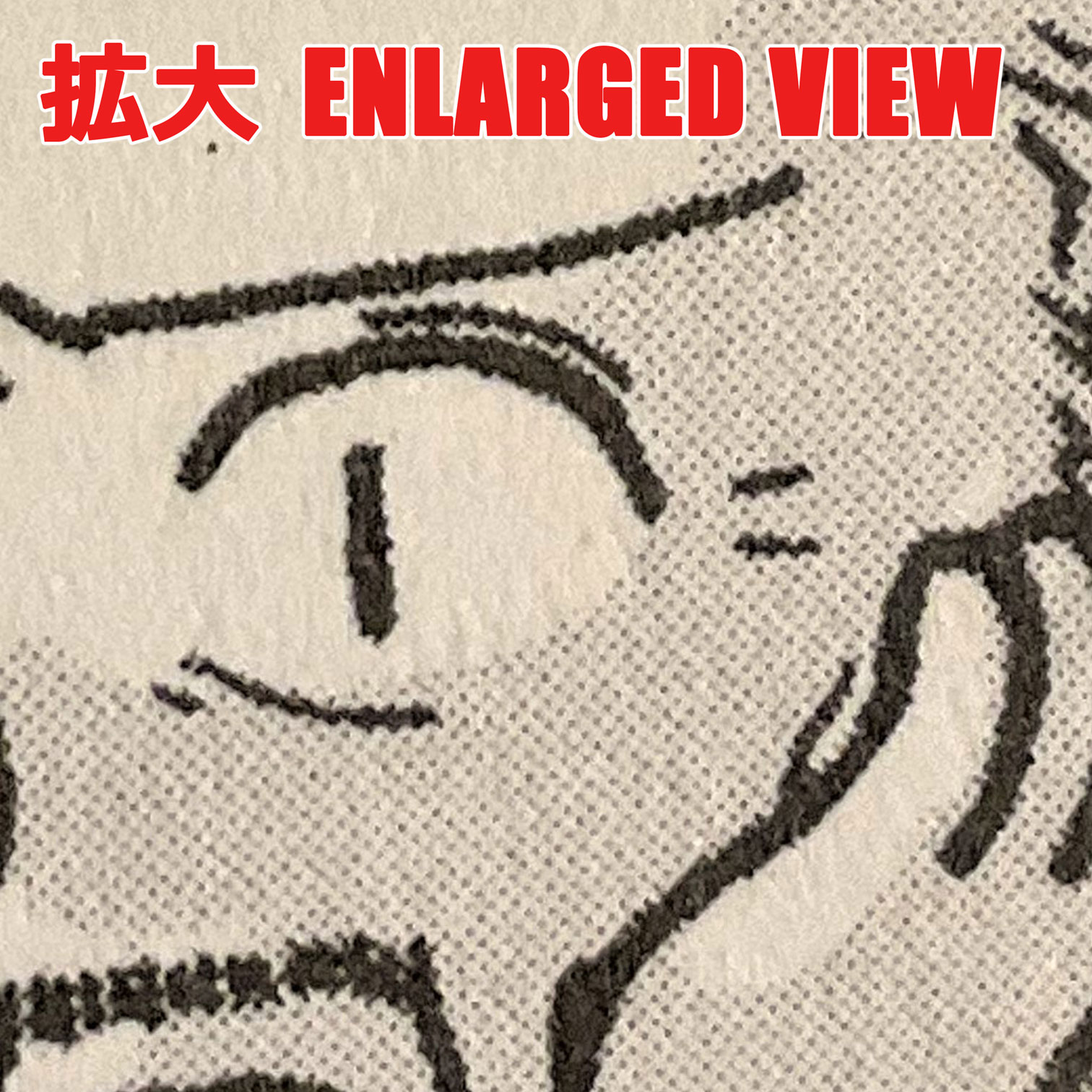
グレースケールで作成した原稿が、オフセット印刷でどう表現されるかのサンプルです。
This is a sample of a grayscale manuscript printed using the offset printing method.
